


Interview with 2023 Grammy winner Dave Van Patten on the award-winning work for Rhino Records for the Grateful Dead
ACHOF’s Mike Goldstein’s interview with artist and illustrator Dave Van Patten on his 2023 Grammy Award-winning (for “Best Boxed Or Special Limited Edition Package”) work for Rhino Records on the IN AND OUT OF THE GARDEN: MADISON SQUARE GARDEN ’81 ’82 ’83! package for the Grateful Dead.

By Mike Goldstein, AlbumCoverHallofFame.com
Posted May 11, 2023
Each year, I look forward to learning more about the talented people who bring their abilities to clients in the music industry, because each year I realize that there are many artists, from all different backgrounds and disciplines, who are asked to contribute to album package projects of all sizes and styles. The past few years, while serving as a judge for some of the better-known packaging awards, I get to see the results of efforts to produce packages that, at least to me, run the gamut from pedestrian (AKA “cookie cutter”) to truly inspired and everything in between. I’m typically most-impressed by artists and design teams that, rather than take the simple path (particularly on projects for clients with a well-establish design guide), try something new and exciting, even at the risk of ticking off the purists who will accept nothing but the status quo.
I personally experienced the wrath of fans for a particular anime series that the company I was working for adapted for an American audience, even BEFORE we showed any of it to the public (“don’t you DARE touch this or change that, or you’ll be sorry” was the typical threat), so when I learned more about how the team behind this year’s Grammy-winning package in the “Best Boxed or Special Limited Edition Package” category approached the project for their client – i.e., the Grateful Dead, the band with perhaps the most-integrated fan base in the music business – and made the decision to introduce some new graphics to the package, my first reaction was “I wonder if they felt the need to take alternate routes to the office for a while?” (perhaps that was a bit dramatic, but I’m damaged goods). Of course, I also wanted to know more about the coordinated effort to produce such an impressive package, so I took my questions to one of the people responsible for this year’s award-winning project – artist Dave Van Patten – to see what he could do to both illuminate the details of the creative/production effort and also show me proof that he’d survived (and in fact, been fortified by) the reactions of Dead fans to the set he’d help put together.
The following interview text combines the transcripts from our March 17, 2023 fact-finding Zoom Interview, along with Dave’s written answers to another set of questions I’d sent him via email.

Mike Goldstein (AlbumCoverHallofFame.com) – Dave, thanks so much for joining in today. How are you feeling these days?
Dave Van Patten – I can’t even say…I’ve been so busy after the Grammys and it’s almost like this weird Grammy blues – maybe I’m a little out of it, a little too much partying, so thanks for your patience.
Mike G – Oh, no, you’re the one who’s giving me your time today, so I greatly appreciate it. Since I have all of the written answers you sent me, I think all I need now is a little more details and some info on your bio. Let’s start off with some questions about your background and then we’ll talk more about the work that won you a Grammy Award. Can you first tell me month, year and place of birth?

Dave VP – I was born in September, 1981 in Orange, CA. We lived up in the mountains near Lake Arrowhead, but I was born in Orange.
MG – One of my favorite towns in Orange County!
DVP – I don’t get down there all that often anymore – I work from home and I’m sort of a cave-dweller in my home in Long Beach, and you get kind of spoiled here because you can just walk anywhere – to get a coffee and muffin or a beer. But I kinda forgot how nice Orange is, so maybe I’ll get down there for one of the art shows they’ve been doing down there for years.
MG – So you’re in Long Beach now full-time?
DVP – Yeah, I’ve been in Long Beach for over 20 years now. That’s how I got acquainted with Lisa from Rhino Records, because she knew my work from local murals and things like that and then she passed my name on to Doran.
MG – Long Beach is also the home of another famous graphic artist and muralist I know – John Van Hamersveld, who you’ll know from his Endless Summer movie poster and some pretty famous album covers.
DVP – I love that Endless Summer movie and had the poster in my room as a kid. Wow.
MG – It makes sense that so much artistic talent lives in Southern California, close to the action of the music business. So, have you always been artistic – did you go to art school, or are you self-taught, or ?
DVP – Kinda both. I went to Cal State Long Beach and started there as an art major, but it was kind of a weird time. I’ve been doing art all of my life and even before college, I was dabbling with photo-realism and was really good at technique, but then I began to get bored and being at a university that wasn’t just an art school – you walk into the library and just smell the books and I’d stumble in to the philosophy section and, as a 19-20 year old, I’d tell myself “well, I really want to be an intellectual, so screw art!” After a couple of years, I switched to become and English major. I wanted to get into writing and be a writer and I had my wanna-be Kerouac phase and still wanted to look at other things, too. I did music for a while, thinking that rather than using my writing talents for short stories, I could use it for music, but after a several year period, everyone from my band had moved away and I realized that I had all of these ideas and was just thinking about communication and realized that a lot of these ideas I had would be much-better communicated via visual art and comics and sequential storytelling. So, from there, I segued back into illustration.
Starting in about 2007, I started making little ‘zines and then, in 2009, started doing art professionally – at first really low-level stuff, doing gigs for local businesses and whatever I could do, working with bands and getting the work out that way. When you do posters for bands, you put them up all over town, so you’re promoting the band and your art at the same time. So, to answer your initial question, I learned techniques in school, but most of my journey’s been self-taught, because I had to learn most everything I know as a professional – like the basics such as coloring digitally, screen-printing and the like – on my own. You know it’s a good time now to do that because you can watch tutorials on YouTube about “how to screenprint” and even muralling. I started spending more time doing murals beginning in 2016 and when I started that, I didn’t know how to paint a 70-foot wall and I tried to do my best but, after a few projects, I figured things out. Now, I have some of my own tricks that perhaps are better than things I might have learned at school, because I learned through trial and error and having to scrap some things. I do think and regret that there are some things – like animation – that I would have learned had I finished out my degree in art.
MG – Well, I think that you’ve done pretty well for yourself, even with your “limited schooling”. So what was it that drew you to working on album covers – did clients find and call you, or was it something you always wanted to do?
DVP – Yeah, I’ve always been a music nerd – I’d say that I even like music more than visual art. It’s my main love. I really like art also and I happen to be good at it, but music moves me more than visual art. It’s kind of an energy thing – you know, in the illustration world a lot of the people who tend to get album work also tend to be musically minded. So, I sought it out, but they also came to me.
MG – Since I know that you’re into silk-screening and screen printing and so many successful artists working in the music business got their starts doing work for and around local musical acts – selling their posters and prints and t-shirts at their concerts – did you do work for bands doing their posters and t-shirts and other stuff?
DVP – Yeah, yeah, I’ve worked with a lot of bands. There was a local Long Beach label called Porch Party Records and a lot of my friends were in it and I would do a lot of their posters. I even dated a girl who was in one of their bands and did her album cover. It was rather incestuous, but we’d all hang out together and I’d share in the vibe of the bands, and we’d work together and I’d contribute my services that way.
MG – How is it that you were first learning about the scope of this project? Had you worked with this client before?
DVP – I didn’t work personally with the band. However, Rhino records worked with David Lemieux (Editor’s Note – the band’s archivist and audio/DVD producer) and Grateful Dead management to put out all of their releases. I personally have worked with Rhino records since 2017, starting with doing the album art for the annual Dave’s Picks live concert archive series for the Grateful Dead. Every year David Lemieux puts out four different live concerts and Rhino records selects a different artist every year to illustrate the entire series. Interestingly, when I first received word from Doran Tyson about doing the album art, I was working in Humboldt County at a marijuana farm. Every October it is trimming season and I was living in a large shed with 30 other people, working day and night trimming weed. When I heard the word from Doran, I took a week off and drew the first cover of Dave’s picks. Since then, I’ve worked with Rhino on various other projects, but I think it’s a funny story considering how it all started.
MG – I’m figuring that you weren’t around, or were quite young, back in 1981 when these concerts were played at MSG, but now that you’ve immersed yourself into their world and picked up whatever vibe you needed to produce the artwork for this package, I’d like to ask to consider what it was, in your opinion, that made The Grateful Dead – their music, their concerts, their fans, etc. – different from those of other popular performing acts?
DVP – Ha ha. Yes, I was quite young. In fact, I was born in 1981. I think aside from the obvious – that the Dead have a cult-like following like no other – the thing that makes them stand out is clearly their live performances. There are no other bands with their level of success that have defined themselves by their live music as opposed to their studio albums. The Beatles were one of the big bands that started the whole movement of creating highly-layered studio albums that are extremely difficult to perform live. And a lot of modern bands have followed this trend. Most of the time, if you really like a band’s studio album, you expect to be underwhelmed at their live performance, whereas the Dead kept the music completely alive, playing the songs differently at literally every show. You never hear the same thing twice. There are no “official recordings” of so many songs. Every live performance is just a living breathing reinterpretation of the song format. I personally didn’t fall love with the Dead until I dove into all their live recordings.
MG – So, with you getting to work on this important Grateful Dead package, I have to ask you – were you a Dead fan?
DVP – As far being a fan of the Dead – it’s interesting as I have kind of a weird relationship with the band. In early college, I was into American Beauty and Workingman’s Dead, but I didn’t seek out their live shows. I thought that those albums were good, but I didn’t like them at “the cult level”. But why did they have so many fans following them around – it’s because of the magic of their music – and I started getting into them about ten years ago or so, so a bit later on. I personally really like their 60s stuff, so hearing the 80s live cuts was cool because there were a lot of really good songs that I’d never heard before, and it’s not like there was ever really a “bad” era…
MG – I understand that this is a comprehensive compilation of the music from several concerts, built around an expansive set list, so I’m figuring that any good design guide created for this project would have had to take into account so many aspects of the promotion and sale of such a product and I’m sure that your work had to integrate the most-important aspects of the band’s well-known design themes. Assuming that was the case, were there particular tracks – or something special about the music overall – from the lists of songs that were to be included in the packages that served as the inspiration for each package’s design scheme? What I really want to know Is whether a) you listened to any or all the music that was going to be in the boxes before starting on the design project and b) whether any of the music – or something about the band’s persona – influenced your approach to the design.
DVP – As I said, I knew I was going to hear a lot of new cuts and was stoked to find a lot of those tracks in this box set. The artwork wasn’t particularly inspired by any singular track. It was more inspired by the vibe of New York City in the 80s being kind of a wild, art-fueled concrete jungle. Then, from that setting, the prompt was to create a bunch of freaky creatures that look like fictional deadheads. We wanted to avoid the traditional Dead tropes with the skeletons and kind of tried to avoid people altogether. We wanted it to feel like a bunch of weird creatures were partying in the jungle on their way to the Dead show.

MG –Did you get any additional guidance – or specific instructions – from the set’s producers that gave you direction on how to design the artwork for the key parts of your main package and then any ancillary items – like the booklet and the items included in it, as examples – that were also needing to be worked on based on the same design guide? Put another way, how were your clients – that is, the label staffers, the records producer(s), etc. – actively involved in any or all aspects of the development of this design? What roles did they take?
DVP – I personally don’t remember getting any direction from anyone other than Lisa and Doran. By the time they had contacted me they had already decided on the general format of the box, and my role was to fill up the space. And it wasn’t exactly “direction” they issued me – any art direction was definitely a collaboration between the three of us. Rhino records has its own department that deals with Grateful Dead releases, so I’m sure Ivette Ramos and the other people who work on the Dead releases had plenty of input behind the scenes. Lisa and I are more music nerds in general, but Doran is a bona fide Dead expert. It was a challenge since we tried to get away from the traditional Dead imagery. We had to think, if there were a bunch of deadhead creatures partying, what would they look like? I think Doran said, “stoner Muppets”.

MG – With the Cookie Monster on hand to take care of anyone with the munchies…So, in addition to the custom case and amazing amount of music included, one of the stand-out aspects of this special package was all of the bonus content you created – particularly, the booklet, which included a set of postcards, a sticker package, the tear-out coloring book sheets and, to hold the discs, the multi-fold CD sleeves, each with its own artwork – that provided collectors with additional info on the concerts and the venue (i.e., NYC). Can you give us any insight into the decisions to produce some of these materials as well?
DVP – The design decisions made regarding the elements included in the box were a collaboration between the three of us. We had considered just recycling imagery from the cover to use on the book cover, but Lisa and Doran liked my new rendition of the Bears so much that we decided to re-draw that and have that serve as a focus for the book cover. The stickers were their idea. I can take credit for the postcard idea. I drew the handwritten font, then Lisa did the time-consuming process of laying out all the fonts. I’m a good illustrator, but I can’t say I’m a good designer. Lisa did all of the design magic as far as laying everything out, compiling the book, implanting that vibrant yellow backing that makes everything else pop, and doing all the layout for the various CD packages. Lisa’s magic really took my drawings and presented them in the best possible ways.
MG – Did any of the band participate in the making of the package you worked on, or did you get to meet any of the band or band management to discuss any of the artwork that was going to be used?

DVP – No, Rhino works with them. I didn’t work with any of them directly, but I did hear some feedback that was cool. Doran is so much of a Dead expert and knows the vibe that they like so her being involved with the project was almost like being able to speak with the members themselves. She’s really in tune with their vibe… Lisa works for Rhino, so she’s involved with many different projects, but – at least I think – Doran does only Dead focused projects, so if or when we turned in drafts of things that weren’t “Dead enough”, Doran would veto them, so it was a good balance of having a bona-fide Dead expert in Doran, while Lisa and I were more design minded and trying to fuse everything together. Like I said, it was a good balance.
MG – Based on your take of all the people involved in this project and knowledge of the music business today, what is it that makes Rhino Records – and by that, I mean the label and its approach to packaging music – different from other similar labels in its category?
DVP – As a freelancer, I haven’t been able to see all of the projects Rhino has released, but the ones that I have seen have all been top-notch quality in every way – really well thought out art, a real attention to detail, a real focus on the music fans and their love affair with the band, and a great deal of innovation. Since Rhino is a re-issue label, when they put out box sets it’s their time to shine and put out something either never released before or an impressive package of compiled work. Either way it’s their time to create something completely new, and they take no shortcuts with their work. Every project I’ve ever done with them has had multiple revisions and displayed a tireless pursuit of what makes the designs “perfect” for the specific project. Even just working with the Print House to get the ink vibrancy right was a process that took weeks. Literally every detail was done with a lot of hard work and love.
MG –Can you give me an estimate of about how long your piece of the process took, from start to finished product?
DVP – It’s hard to say exactly how long the project took, because so much of my work involves walking around the block and thinking of ideas, so my best guess would be about 3 to 4 months.

MG – Did the COVID pandemic effect your efforts on this project? While the restrictions and disruptions caused by COVID may have added a lot of time to the overall process, were you all able to quickly adjust to the “new” ways of working?
DVP – Luckily, COVID didn’t really affect the progress of work on this project. I believe the Rhino staffers are allowed to partially work from home, and I work from home all the time, regardless.
MG – Were you given enough resources – money and/or time – to do what you wanted to do and what you felt was needed?
DVP – Yes, I was definitely given enough compensation and time for the project. In my opinion, the compensation was very good. Looking back at it now, regardless of the timeframe, I remember actually being a couple weeks late on the deadline, but luckily Rhino was able to extend that and still put out the release in a timely manner.
MG – It’s nice when you get the time to think and work – there aren’t a lot of companies that give creative and production folks the time to do their best work, so it’s cool to hear that Rhino understands that. Now, on to more of the nitty-gritty details. Were there any special tools you used, or work processes followed – manual or computer-based – that helped create the finished products?
DVP – I just used the tools I always use. I actually had to buy a new computer because the files I was working with and the different drafts were all a couple gigabytes each and my computer was freezing up. But typically, my process is a hybrid of physical and digital work. I draw everything by hand first, then scan the different elements before coloring them digitally.
MG – So this project found you working with Lisa Glines and Doran Tyson, who also both have impressive portfolios of album package credits. What were your take-aways after having had a chance to work with some of the most-influential art directors/designers in the modern music business? Did they leave you with any words of advice that affected your approach to projects like these, and this one in particular?
DVP – Yes, every time I get the chance to work with Lisa and Doran it’s a thrill. They both have multiple Grammy nominations, and they are so professional and creatively skilled. I have worked with them before and even spent six months in their offices painting a mural, so I know them both personally. I think we have similar tastes. Throughout the process, It was more like working with two fun friends.
MG – While the sales of products and the Grammy Awards win were good Indicators, do you feel that everyone involved in the production of these sets was truly happy with the results? If so, how did they express that to you?
DVP – From what I could tell, everyone was really happy with the product. I recall some “Deadheads” didn’t like the art it at first – based on Twitter comments I read – because it was a departure from traditional tropes, but the overall feedback was amazing. David Lemieux himself said that the art was possibly “the most beautiful art to ever grace a Grateful Dead album cover”. I also heard through the grapevine that the drummer Mickey Hart was really happy with the design. Aside from that, different people I worked with through the process were really excited. The printing manager said it was her favorite project that she’s ever worked on. Through this process, Lisa and Doran joked around that we were going to get a Grammy, but I don’t think I believed them at that point, ha ha.
MG – Before we change gears a bit and become a bit more philosophical, I’d like to ask you if there is any other anecdotal info about this project you’d be willing to share – without betraying any confidences, of course. It seems that nearly every project I’ve ever looked into seems to have something of an “ah-ha or “OMG” moment”, so anything you’d be willing to share would be quite a treat!
DVP – I think the real “aha” moment for me was actually pretty profound. I was watching one Dead documentary where they talked about the music communicating with the fans and the fans communicating back in some psychic sort of way. When I finally really dialed in on the project, I was feeling the same way, as if the music was almost guiding me into what characters I should draw. I feel like, unknowingly, the Dead music collaborated with me. It was a very unique experience from any project I’ve ever done before.
MG – So when I ask you to think about whether your effort was a work of self-expression, based on your last answer, it seems that the music impacted your own natural style a bit, wouldn’t you say?
DVP – Illustration work is always tricky because there’s always the attempt to share your personal style along with the vision of the client, and if you can achieve a middle ground where the client and you are very happy, then that’s usually the best work.

MG – Let’s talk a bit about some other topics I’d like to get your opinions on – First off, with the electronic delivery of music products now the dominant way they’re brought to consumers, are you noticing any more or less enthusiasm on the client’s – or the artist’s – behalf to invest time and money in packaging that helps their products stand out?
DVP – Absolutely. Considering all the digital releases, less emphasis is put on physical packaging. However, culture can be pretty reactionary. I think at the same time, because of the digital world, people are returning back to wanting physical products. I believe that vinyl record sales are up as a result of this.
MG – I’ve always believed that iconic album cover art has had a noticeable effect on Pop Culture in many ways. How do you think album cover art helps us document human history? What’s your take on this – is the imagery and music providing the direction, or is it reflecting the culture, or ??
DVP – I couldn’t agree more. Iconic album covers have always stood out in history as almost important as the music on the albums. And the accompaniment of the two are really what create the best music listening experience. It’s obviously every illustrator’s dream to create THIS generation’s iconic album cover. Probably the most recent example I could think of would be in Nick Gazin‘s art for Run the Jewels.
MG – When the Grateful Dead first began to market band-related products – the record, posters, t-shirts, smoking accessories, etc. there wasn’t an internet, so musicians had to rely on other forms of promotion to get their music into peoples’ homes – endless tours and radio. Since the band allowed anyone to record their shows and then share them with other fans, an entire bootleg business grew from those recordings. There are several web sites where fans can see some of what’s been produced over the years – http://gratefuldeadcoverart.blogspot.com/p/grateful-dead-cover-art.html and http://gratefulwebs.atspace.com/bootleg_covers.htm are both fine examples. Have you seen any/many of these products and have you got any opinions as to how they were packaged and promoted?
DVP – I think overall the Dead does a great job marketing and packaging its live releases. They know that the fans are always eager to hear different cuts of their favorite tracks. It’s always something completely new, so they kind of sell themselves.
MG – Let’s continue on with a question that always elicits a broad range of responses, so here goes – as part of doing the research for the articles and bios found on the ACHOF site, I will always find examples of something that makes me want to work harder to make sure that credits are given where due – those being the ongoing examples of where an artist’s work had been used and, on occasion, abused by labels, print publishers, licensing companies, technology companies and/or other musical acts without permission or without giving proper credit for the work being used. It seems that, in an age where people seem to find it permissible to “borrow” – it sounds so much better than “steal” or “plagiarize” – an artist’s work to help them promote and sell their own products, folks that create original art have been forced to police the print and digital media outlets to do what they can to either stop this unauthorized use or, at least, receive credit for the work they’ve done. Have you – or any of the artists you know or have worked with – been victimized in this way? Is there anything that can or should be done about it, or do you simply chalk it up to being one of the costs of doing business these days?
DVP – From time to time I see other artists’ work that seems potentially inspired by my work, but I can’t hate on that because I’ve been inspired by a lot of people as well. I haven’t experienced much where my art was blatantly stolen other than a handful of local Long Beach businesses who will sometimes tend to approach this a bit more casually since I know them personally. Sometimes friends take more from you then they probably should.
My thoughts about this in general is that it’s obviously despicable anytime anyone steals artwork. People still treat artists like they are desperate cockroaches begging for a meal, so people push the boundaries and get away with it. This has more often happened to me if I’m working for a mural client. They’ll have me create several compositions, then decide not to pull the trigger on the mural and I’m left with this un-used work. It’s important for artists to charge for the sketches and compositions even if the projects don’t see fruition because Artist’s time is as valuable as anyone else’s.
MG – OK, I get it. So, have you gotten your Grammy statue yet?
DVP – No, not yet. I haven’t heard anything yet. I have a couple of pets, so I’m going to have to put it high up somewhere.

MG – I’m sure you’ll find just the right place. Dave – thanks so much for your time. Nice meeting you.
DVP – Thanks for putting this all together!

About our interviewee, Dave Van Patten (derived from Dave’s site bio) –
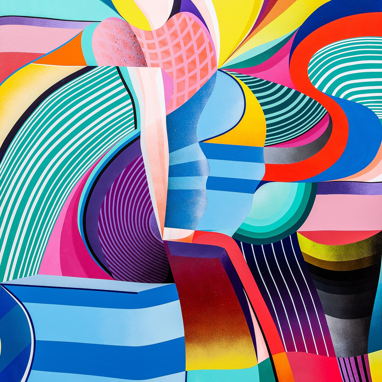
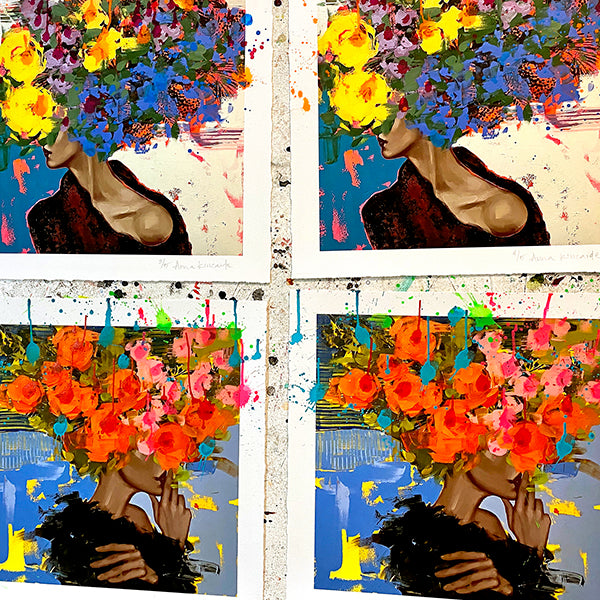
Dave Van Patten is a Long Beach/ Los Angeles based illustrator and muralist best known for his colorful imagery, playful surrealism, and humorous tone. The bulk of his inspiration is pulled from dark humor comics, 1960’s surrealism, psychedelic garage rock albums, and modern societal absurdity.
With a foundation in Indie comics, Van Patten branched out into large scale mural work, participating in the world renowned mural organization, POW!WOW! in 2016 and 2017, allowing his tiny comic drawings to span across entire buildings. Since then, Van Patten has painted dozens of murals, working with clients such as Starbucks, Whole Foods, Quiksilver, local city programs and several local breweries and coffee houses. Dave’s murals can also be found gracing the walls of Warner Music/Rhino Records’ corporate offices and promoting musical performances and art shows all over southern California – http://www.davevanpattenart.com/portfolio#/flyers/
Dave’s artwork and illustrations can also found in the publications and media organizations including Juxtapoz, Vice, NPR, The Hollywood Reporter, O.C. Weekly, LA Record (which Dave calls “the coolest music magazine, but I haven’t heard much from them since COVID, sadly”) and MEL Magazine, where he’s contributed a ton of editorial illustrations over the years. He has self-published several graphic novel “zines” and twisted “children’s books for grownups.” Currently, he is adapting a short story from Portland-based Arthur Bradford into a full-length graphic novel.
In addition to his work on the aforementioned box set for the Grateful Dead, other notable album package projects Dave’s credited with include – Grateful Dead – 2017 Dave’s Picks: Grateful Dead Live Concert Series ; Les Claypool’s Duo De Twang – Four Foot Shack; The Jackals – People, Dust and Raspberry Moon; Rainman – Digiphrenia; Dustin Lovelis – Dimensions; Dream Cars – Never Let Her Go; The Barrelhousers – The Barrelhousers; Alicia Murphy – Towns Cities & Little Ditties; Words – Earwig; Half-Yeti – 33-22
See more of Dave’s work on his website at http://www.davevanpattenart.com/
About the award-winning set that Dave (and Rhino Art Director Lisa Glines and V.P of Digital Strategy and Global Brand Marketing Doran Tyson) put together that won them a Grammy Award this past February (as described on the label’s website) –
IN AND OUT OF THE GARDEN: MADISON SQUARE GARDEN ’81 ’82 ’83!

Originally released on September 23, 2022, this 17-CD Limited Edition Set was available exclusively via the Dead.net site – “Features Six Previously Unreleased Concerts Recorded Live In New York City At Madison Square Garden Between 1981 And 1983
IN AND OUT OF THE GARDEN touches on the three-year period after 1980’s Go To Heaven was released, a time when the Dead were constantly on the road, playing more than 200 dates. While they were in no rush to return to the studio during this time, they continued to write new music. In 1982 and ’83, the band performed most of the songs that would appear on 1987’s In The Dark, a Top 10 double-platinum album that stands as the group’s biggest commercial success. The new collection includes performances of four songs from that album – “Touch Of Grey,” “Hell In A Bucket,” “Throwing Stones,” and “West L.A. Fadeaway” – plus the B-side, “My Brother Esau.”
The set comes in a custom box featuring new artwork by Dave Van Patten celebrating the band’s eclectic fanbase, with a cavalcade of illustrated Dead Heads. The collection also includes detailed liner notes by award-winning music journalist David Fricke, who explores the band’s connection to the Big Apple. He writes: “Welcome to the unique, enduring phenomenon of the Grateful Dead in New York City, a mutual devotion, forged in concert, that ran for nearly as long as the band itself—from June 1, 1967, a free show in Tompkins Square Park on the Lower East Side (ahead of the band’s official, local bow at the Cafe Au Go Go), to the Dead’s last Garden run, six nights in October 1994…the Dead’s affinity for New York City…was instant and arguably their most profound with any city aside from San Francisco.”
In addition to the numbered limited-edition (one of 12,500 sets) big box, the label also released a 3-CD set the offers one full show from the set – Madison Square Garden, New York, NY (3/9/81)
If you’d like to add the box set to your own collection, you can find this package via this link – https://store.dead.net/en/grateful-dead/home/in-and-out-of-the-garden-madison-square-garden-81-82-83-dead.net-exclusive%5B17cd%5D/081227884291.html while the 3-CD version is available at https://store.dead.net/en/grateful-dead/home/madison-square-garden-new-york-ny-3981-%5B3cd%5D/081227884307.html
I also found a nice “Unboxing” video that slowly-but-surely takes you through the details of the box set – https://www.youtube.com/watch?v=ntyvDSJOkd0
One last Editor’s note – After Dave first mentioned that he was born in Orange, CA, my mind quickly drifted to memories of the time my wife and I lived in nearby Old Town Santa Ana, CA for a number of years. Orange was home to some of my favorite restaurants, including the Felix Continental Café Cuban restaurant located in the locally-famous “Orange Circle” – http://www.felixcontinentalcafe.com/ – order the Frittata Italiana with a side of fried plantains for a truly-blissful breakfast.
Unless otherwise noted, all text included in this article is Copyright 2023 Mike Goldstein (AlbumCoverHallofFame.com) and all images (except for the images of the award-winning box sets) are Copyright 2022 Dave Van Patten and Warner Brothers/Rhino Records – All Rights Reserved. All of the trade names mentioned in this article are the properties of their respective owners and are used for reference only.